The man who Redefined Jazz Album Covers: S. Neil Fujita
- Rachel Goodchild

- Feb 3
- 5 min read
Updated: Apr 24
Translating Rhythm, Mood, and Improvisation into Visual Form.

S. Neil Fujita (b. 1921 d. 2010)
Fujita was a highly influential American graphic designer whose work helped define mid-20th-century visual culture, particularly in album and book covers. His designs remain iconic and widely recognised in both music and publishing.
Early Life & Background
Born Sadamitsu Fujita in Waimea, Hawaii, to Japanese immigrant parents; he later adopted the name “Neil” while at boarding school in Honolulu. He studied art at the Chouinard Art Institute in Los Angeles, focusing on painting, design, and illustration. During World War II, his studies were interrupted when he and his family were forcibly relocated to a Japanese American internment camp. After internment, he volunteered to serve with the U.S. Army’s 442nd Regimental Combat Team, a segregated unit of Japanese American soldiers.
Before fame, Fujita saw himself primarily as a painter. He was Influenced by Abstract Expressionism and Bauhaus principles. His artwork focused on gesture, texture and emotional abstraction. This fine-art mindset never left him, and this could be why his commercial work never feels commercial.

Revolutionising Album Cover Design for Columbia Records (1954 - 1960)
Fujita is perhaps best known for transforming the look of record album covers, especially jazz records, by bringing modern art sensibilities into everyday visual culture.
1954
Fujita was hired by Columbia Records to head its design department, to modernise the label's image. He developed a functional approach to record artwork and introduced abstract painting, photography, and fine art concepts into his cover designs. He was one of the first designers to commission painters, photographers, and illustrators to personalise album artwork and convey the character of the music itself. His work from this era helped establish the album cover as a creative art form closely tied to the music that it represented.
Before Fujita started working at Columbia Records, jazz album covers mostly showed musicians’ portraits, but after Fujita headed up the department, album covers could sound abstract before you ever heard a note. He treated album covers as a visual equivalent of the music. The creative techniques he would used were:
Abstract painting
Asymmetry
Bold colour fields
Non-literal imagery
1959
The 'Time Out' album cover, (the Dave Brubeck Quartet) is one of the clearest examples where Fujita used one of his own paintings with irregular shapes that visually echo odd time signatures in the music. Probably one of the most famous jazz albums ever, featuring the hit “Take Five” by Dave Brubeck Quartet.
Fujita based the album cover on a bold abstract painting of his, that echoes the innovative, unconventional rhythms in the music. This cover helped elevate album art to a fine art form, merging modernist visual language with jazz’s experimental spirit.

Another seminal post-bop jazz album with an enduring influence is 'Mingus Ah Um', Charles Mingus. The album cover features Fujita’s expressionist abstract artwork, which reflects the emotional range and intricate textures of Mingus’s compositions. The album was later inducted into the Grammy Hall of Fame and is often ranked among the greatest jazz albums of all time.

Jazz Covers
Fujita’s jazz covers were revolutionary at the time because he was one of the first designers to bring modern and abstract art concepts into mainstream record packaging. In his department at Columbia Records he would often commission painters and photographers instead of relying on standard type and portraits. Fujita would go onto create around 50 album covers for Columbia Records, before leaving to start his own firm.
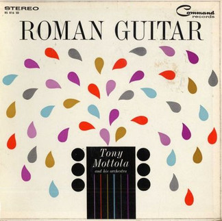
Here are a small sample of some of his work:
Shift to Conceptual Minimalism (1960s–70s)
After leaving Columbia in the late 1950s and founding his own design practice, Fujita became renowned for his book cover designs. In 1963 he formed a design division, Ruder, Finn & Fujita (later it became: Fujita Design), where he broadened his work into publishing and corporate identity. When Fujita later moved into book cover design, his style became more restrained but sharper. He started using less colour, more idea, and typography as metaphor. His negative space was doing the narrative work. One of his most famous book covers is:
The Godfather
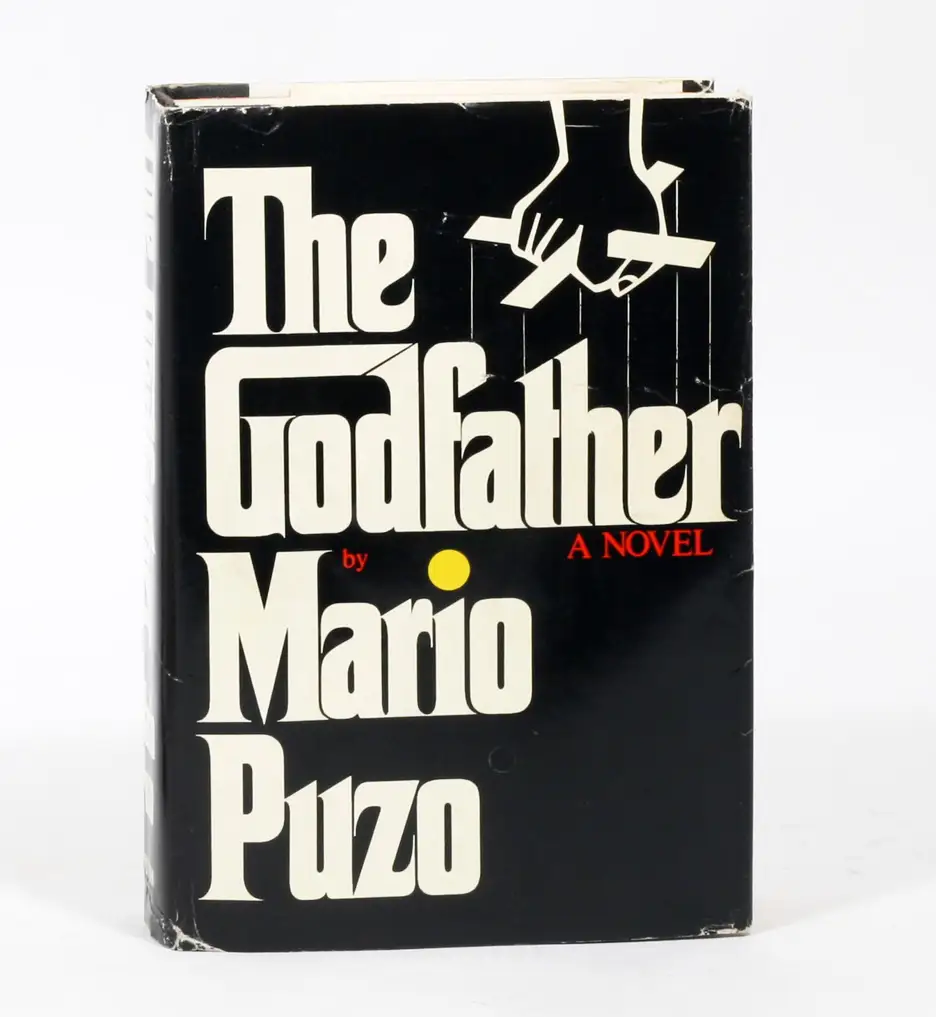
The Godfather was one of his most famous book covers and proves as a masterclass in using the clean typeface, a puppet-string symbolism and just one simple idea - that he executed perfectly. This phase heavily influenced modern branding, editorial design, and even film title design.

Fujita created the now-famous logotype with extended letterforms that evocatively suggest puppeteer strings, a visual metaphor for the story’s power dynamics. The design features a stark, high-contrast, black-and-white silhouette with an extended 'G' forming a house for the word "God" and a hand manipulating a string
The Godfather novel by Mario Puzo with artwork cover by S.Neil Fujita
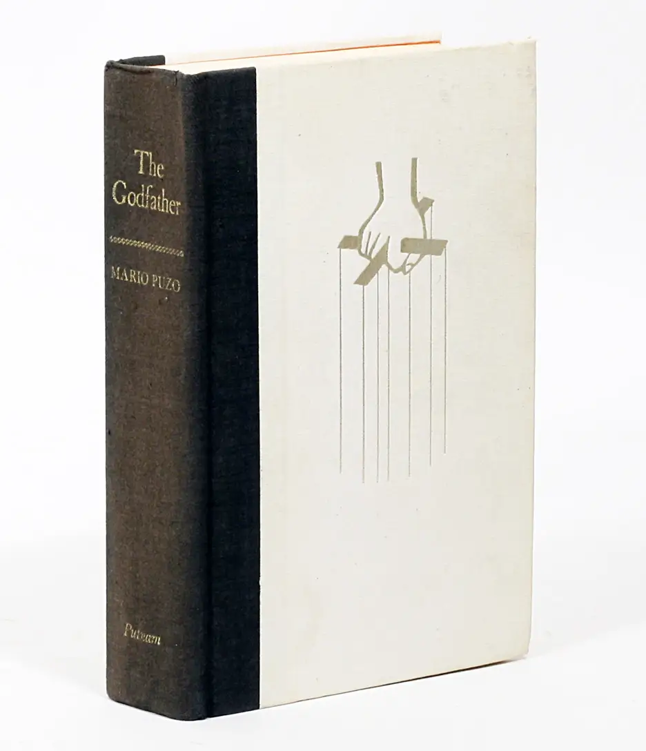
The Godfather Book
Cover artwork by S. Neil Fujita - Published by G.P. Putman's Sons.
The design features an iconic black dust jacket showcasing a white stylised hand holding marionette strings, with the title in white, with no external reviews on the jacket. The first edition was published in 1969.
The Godfather Film
The Godfather film followed in 1972 and they used Fujita's same branding. The design features a stark, high-contrast, black-and-white silhouette with an extended 'G' forming a house for the word "God" and a hand manipulating a string.

Book Covers
Fujita created memorable book jacket covers for authors using typographic simplicity and conceptual design to hint at narrative themes. A few examples:
Magazine Work & Publications
though he wasn’t primarily known as a magazine designer, the way he was for album and book covers. His graphic work was used in magazine contexts, and he designed at least one magazine cover, especially in the 1960s design world. The use of his artwork in magazines reflects his reputation in the design community during the 1950s and 60s, when leading publications showcased international design trends. A few examples:
Teaching Years
Fujita later shared his expertise as an educator, teaching design at institutions such as:
Philadelphia Museum College of Art
Pratt Institute in Brooklyn
Parsons School of Design in New York
Fujita's Legacy
Designers have described his style as blending Bauhaus principles with a Japanese aesthetic sensibility, giving his work clarity, modernity, and emotional resonance. Today he is remembered as a pioneer in graphic design, whose covers helped shape how generations visually experience music and literature.
Before Fujita’s influence, jazz albums and book covers were often functional or simple documentary-style (photos of artists/authors). Fujita managed to bring a modern art sensibility, abstraction, conceptual typography, and a visual metaphor. He treated covers as an artistic expression in its own right. By visualising sound and story his designs didn’t just decorate covers, they interpreted the music, hinting at rhythm, mood, narrative, or cultural context through colour, shape, and composition. Many of these album and book covers are still iconic, decades later. They still continue to influence contemporary designers of today.
A short film about S. Neil Fujita by PBS:
Related Articles
The National WWII Museum: S.Neil Fujita: An Illustrated Life
S. Neil Fujita obituary:
Rachel Goodchild | Design Blog
Creating Pattern for Textile, Product, Home & Packaging
.png)


